
BarBox
The team at Kozuba & Sons reached out to us with a brilliant idea for their new cocktail venture; ready-to-drink, “bag-in-box”, craft cocktails. BarBox makes it possible to bring the party wherever you go, without sacrificing on quality. Each and every BarBox cocktail is crafted with artisan spirits and is packaged for daily adventures. The team at Hype jumped in on this exciting project to name the ready-to-drink product and develop the branding and packaging identities.Scope
Naming Brand Development Packaging Design
Photography
Naming
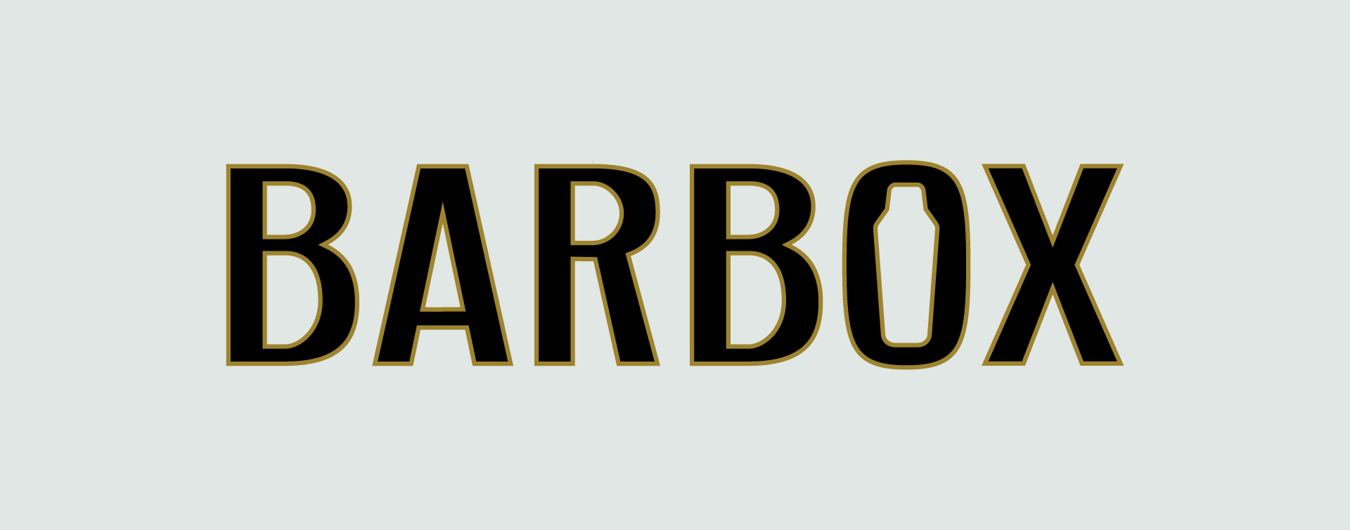
When we began brainstorming names for these tasty boxed cocktails, we wanted one that was both unique and memorable. The name BarBox plays up the idea of having a bar in a box. It's short, sweet, and to the point. It feels simple and cool while quickly describing the product at first glance. Plus, it looks pretty great on a box, if we do say so ourselves.

Brand Development
At Hype, when we start to develop a new brand, we dive deep into who the target audience truly is and what they’ll be the most drawn towards. In the case of BarBox, we were working to create a brand that struck a chord with Millennials, those who seek adventure and are always on the go, and those who value quality. We wanted the brand to feel bold and mature, but still fun and exciting. From the colors and font choices to the minimalistic cocktail illustrations on the back of each box, we want anyone who picks up a BarBox to know that they are in for a good time, while still getting to enjoy artisan-crafted cocktails with just a simple pour.


Packaging Design
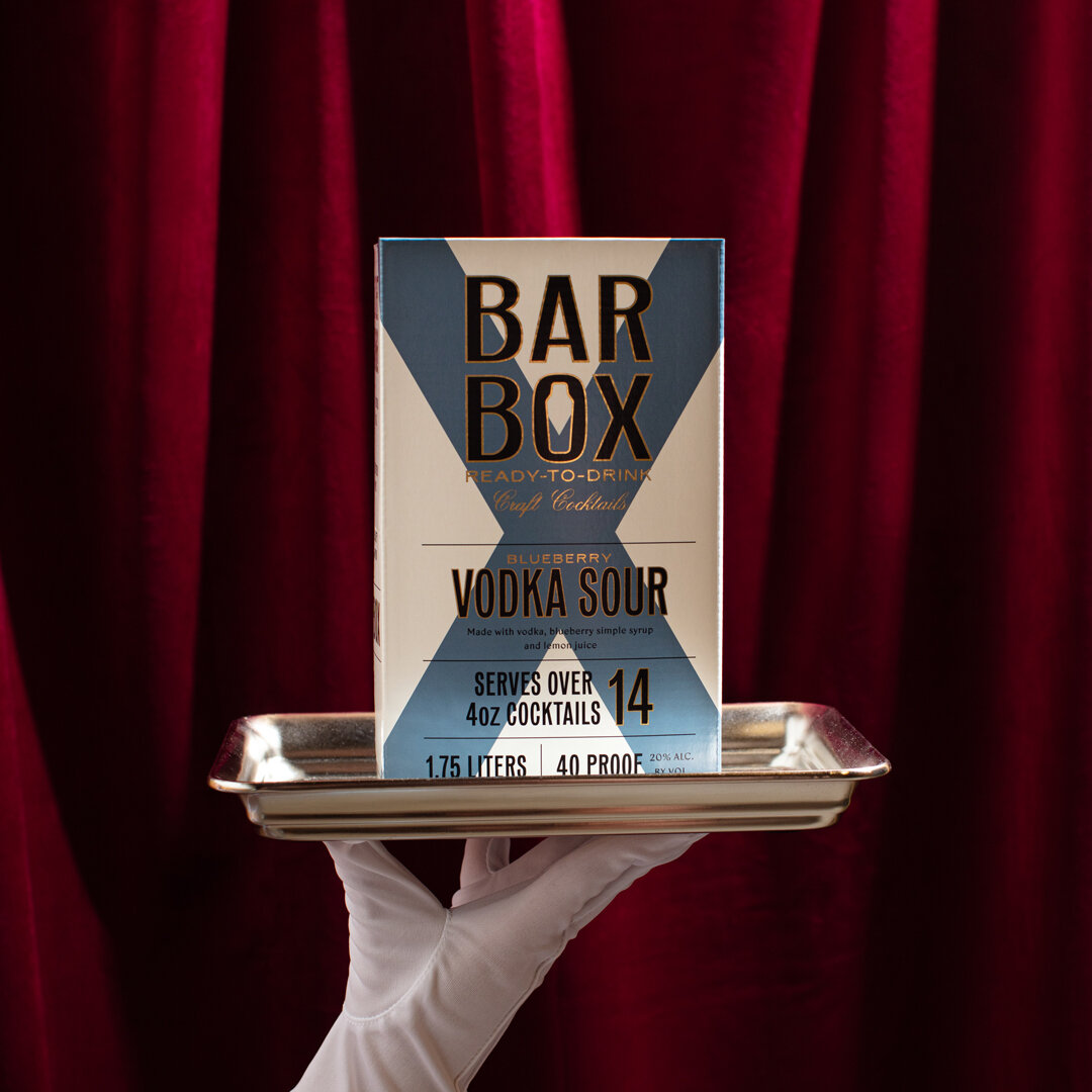
Once we nailed down the perfect name and developed the brand, it was time to dive into creating packaging that would stand out and catch consumers as they perused the shelves at their favorite liquor store. The “X” in the middle of each box is a call back to the idea of alcohol being represented as an X back in the day and ties into the “X” at the end of BarBox. In the center of the “O” within the BarBox logo, is a silhouette of a cocktail shaker. As a whole, we wanted this brand to feel both playful and sophisticated, just like their target audience.
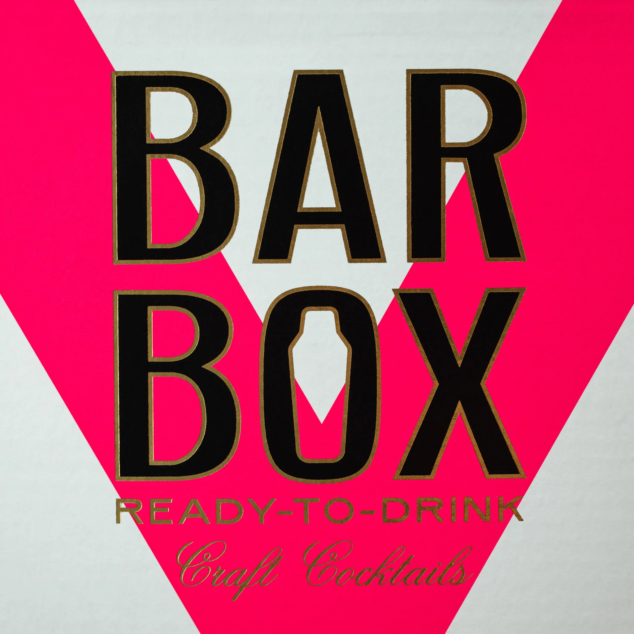
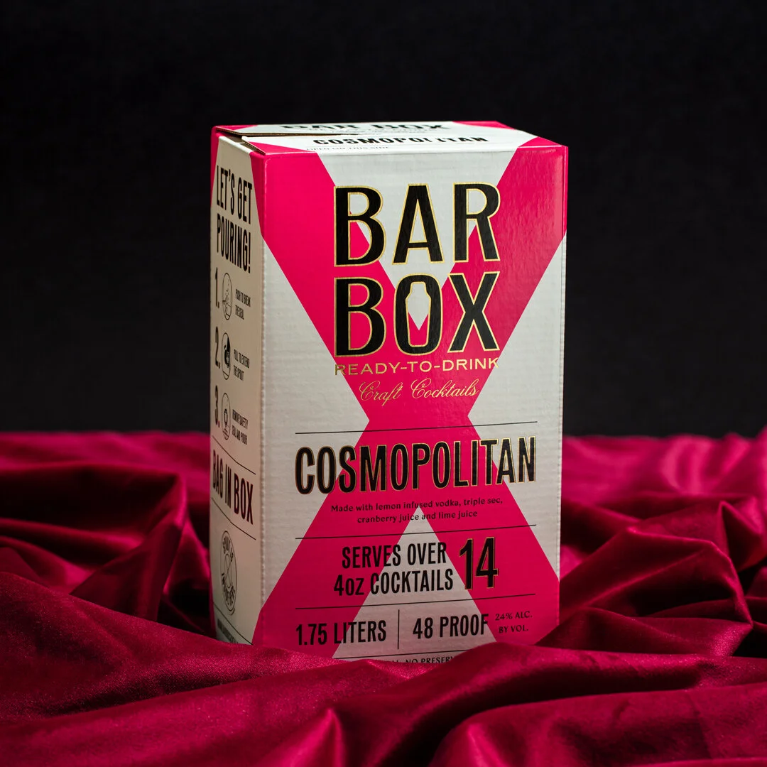
We wanted this brand to feel both playful and sophisticated, just like their target audience.


Learn more about Kozuba & Sons Distillery and try BarBox for yourself here.
