Etairos Health
The Etairos Health team came to Hype looking for a very specific solution for their business needs. The company provides care for elderly and disabled consumers in a variety of specialties and services. After purchasing four very different looking acquisitions, Etairos was looking to reinvent their overarching image and create consistency between the brands for consumer facing opportunities without losing the familiarity and credibility that they all have built with medical entities. Scope
Brand Foundation
Branding
Brand Evolution Brand Extension
Brand Foundation
When it came to helping Etairos Health find their voice, we knew we needed to craft a message that consumers connected with on more than just a surface level. As we got to know the Etairos Health team, we quickly understood that they thought of their patients as an extension of their family. So when creating the written representation of their brand, we focused on their devotion to providing compassionate care, while offering comfort and support during times of need. We also positioned Etairos Health as a trusted brand that works to make the lives of their patients and their families easier, every single day.

Branding
The Etairos Health branded house had a few needs to consider. Each of their acquisitions built a brand that physicians and medical professionals came to recognize but they wanted to reach more of a consumer facing audience. This could be elderly or disabled individuals looking for care for themselves or their spouse, the children or family member or an elderly or disabled individual looking for care for their loved one, or an individual of any demographic planning for the future. The outcome is an overarching brand identity that is fresh and modern with a nod to the medical field, while emphasizing feelings of comfort and support.

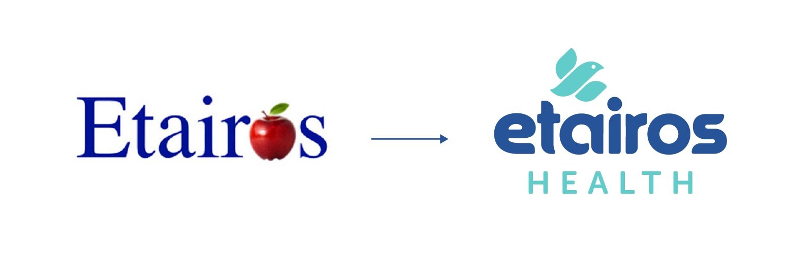
This was translated through a calm, pastel color palette and soft gradients to create a soothing experience, accompanied with a darker color to represent the credibility of Etairos Health in the medical field. For this instance, the brand icon of a bird emulates the shape an "E" for "Etairos" and a representation of the word, which means "companion." The angle in which the bird is nestled above the letters in the primary logo evokes a protective and guided feeling. The typography was chosen for the house to add consistency, while alluding to a solid and trustworthy establishment. Lastly, the photography style and treatments capture feelings of intimacy, warmth and are meant to really tug at those heart strings.


The outcome is an overarching brand identity that is fresh and modern with a nod to the medical field, while emphasizing feelings of comfort and support.

Brand Evolution
Once the overarching brand was solidified, our team extended the identity to marketing materials, collateral, website, mobile app, office supplies, and apparel. The use of gradient hues laid over the emotional imagery added softness and depth, as well as a unique solution to text visibility. The consistency of the brand is easily held together by three primary assets: the logo type, logo mark, and icon. This ensures that future production, regardless of the branded house it’s for will always be cohesive and on brand.


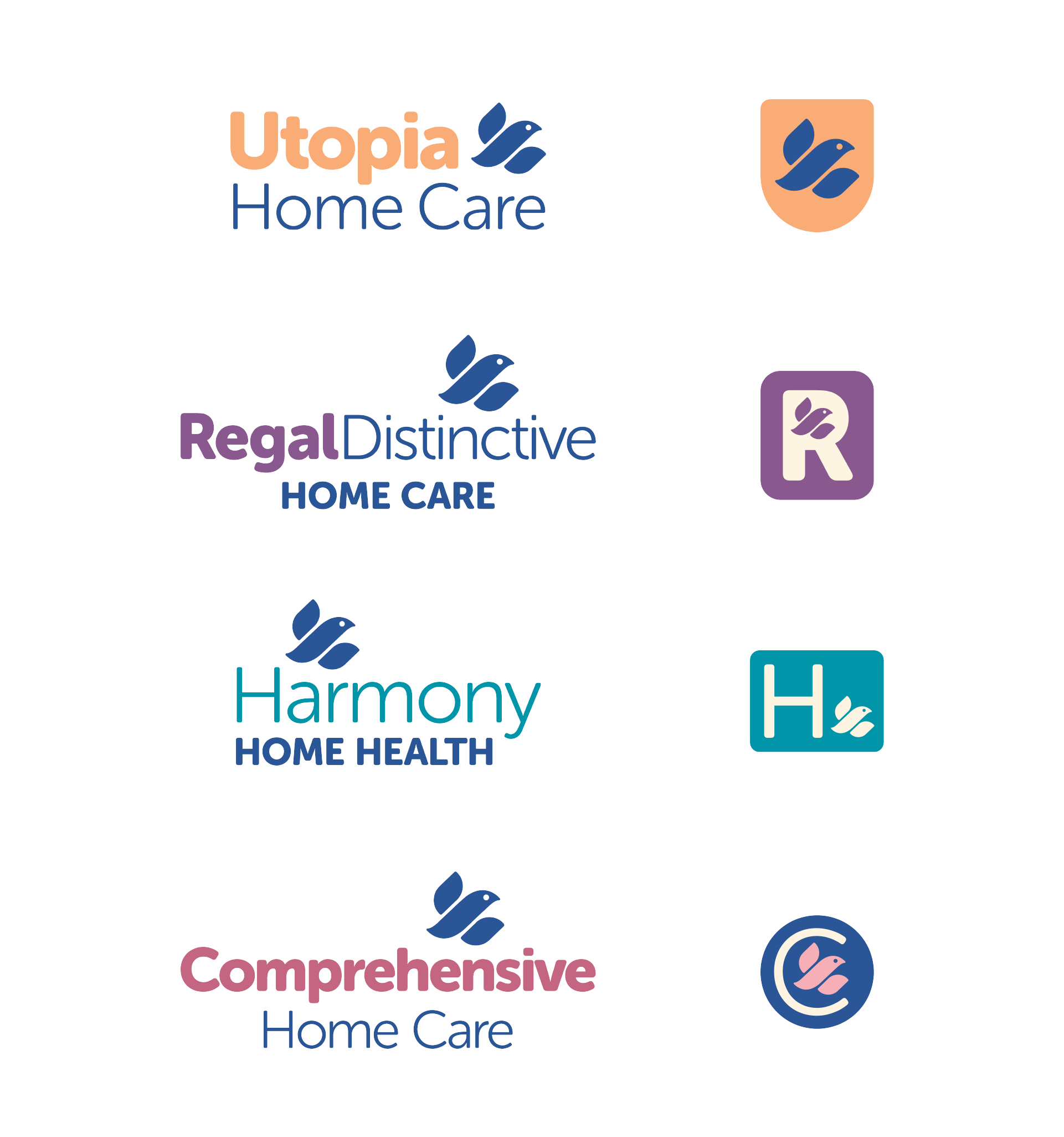
Brand Extension
Our last task was to extend the new brand identity to each acquisition. Each name was slightly different in length, required its own particular descriptor, and had a designated color palette. We also needed to consider that there will be instances where the logo marks will be displayed together and separately. Each acquisition required it own research and consumer consideration. Ultimately, each brand was given a logo variation, updated color palette, and icon system that not only is consistent with the other Etairos Health brands, but is individual to itself and target audience.