Green Bench Brewing Co.
As the city’s first microbrewery, Green Bench Brewing Co. set the tone for the local craft beer scene that would soon explode on both sides of the bridge. Hype was selected to build the brand from the ground up and played an integral role in the opening of this St. Pete staple.Scope
Branding
Packaging
Photography
Branding
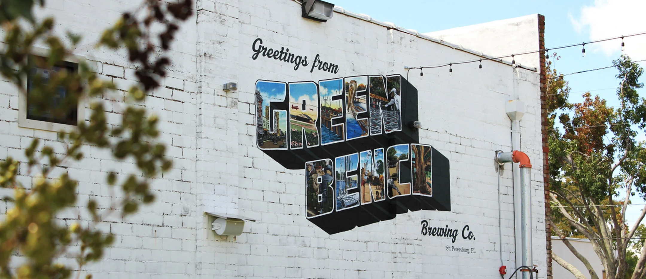
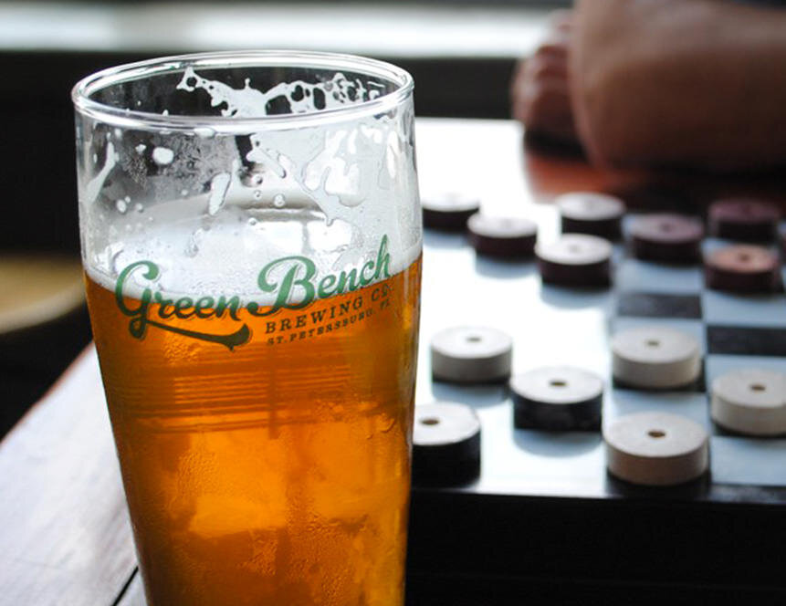
Owners Nathan Stonecipher and Steven Duffy wanted to pay homage to the city’s history, hence naming the brewery after the green benches that lined our streets in the early 1900s. Our goal was to create a brand that was timeless while also honoring our city’s past. The result was a hand-drawn typographic logo accompanied by various brand assets and illustrations.
Packaging
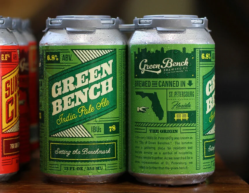
With branding in place, we shifted our focus to Green Bench’s core line-up of quality brews. We needed to create a system that was versatile enough to capture a different element of our city with each name, but still feel cohesive as a set. We developed a bold graphic layout with custom colors and stamp illustrations for each name that would be applied to Green Bench’s IPA, Happy Hermit, Postcard Pilsner, and Sunshine City. After years of success, Green Bench would eventually apply this label structure to specialty brews such as their Skyway Hazy IPA, Coffee Pot Bayou Stout, and Bench Life Lager.
As successful years have chugged along, we’ve had the privilege of working with Green Bench in every facet of design, including special beer release labels, core can designs, tap handles, merchandise, gig posters, and other print and digital collateral. You can often find our team in the beer garden on Friday nights or scooping up a 6-pack from the taproom.


