Home Stretch
Home Stretch, a digital sub brand by NFM Lending, was developed to be a safe place online where anyone can go and trust that they are on their personalized path to homeownership. Their goal is to make people feel empowered to take control of their home buying journey and feel confident in their ability to make the right decisions for their goals and their lives. Home Stretch talks to their audience in real terms, using language that real people can understand.Scope
Naming
Key Messaging
Brand Development

Naming
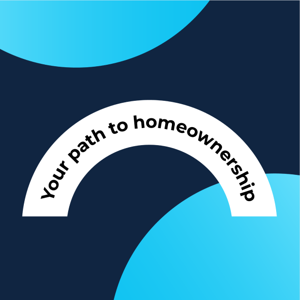
People using this digital service are working towards being ready for homeownership. By following the app’s courses, users get closer and closer to purchasing their own home. The name our team developed for the brand portrays the fact that “you’re almost there”...you’re in the Home Stretch. It also plays up the word “home”, a word we felt was critical for this service.
Key Messaging
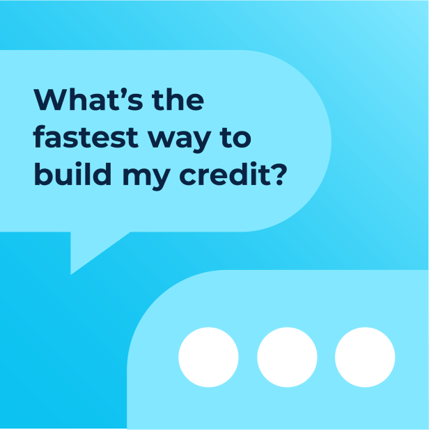
Trust is a key factor in the Home Stretch brand. Our goal with the Key Messaging was to convey that Home Stretch is the go-to place for anyone who is getting ready for homeownership, regardless of their current qualifications, and use a modern approach to create a trusted, judgment-free path to home ownership. The brand is personable, friendly, engaging and not intimidating.


Brand Development
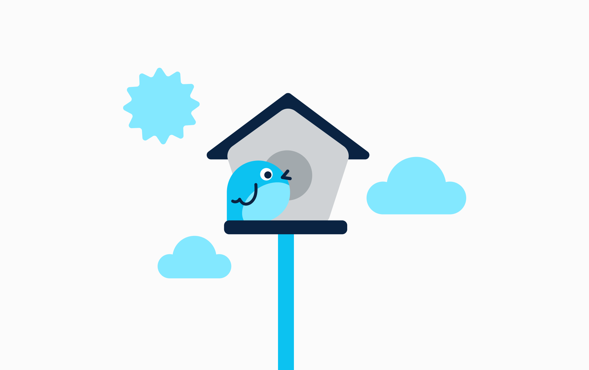
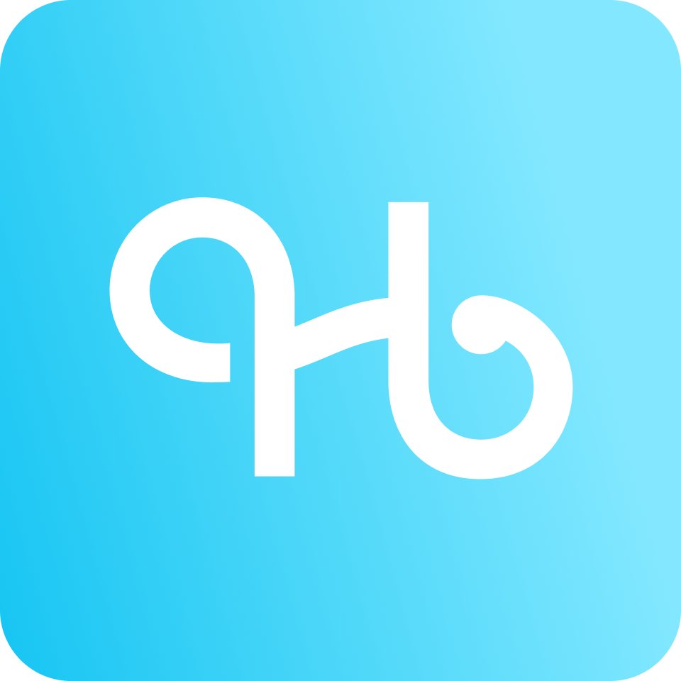
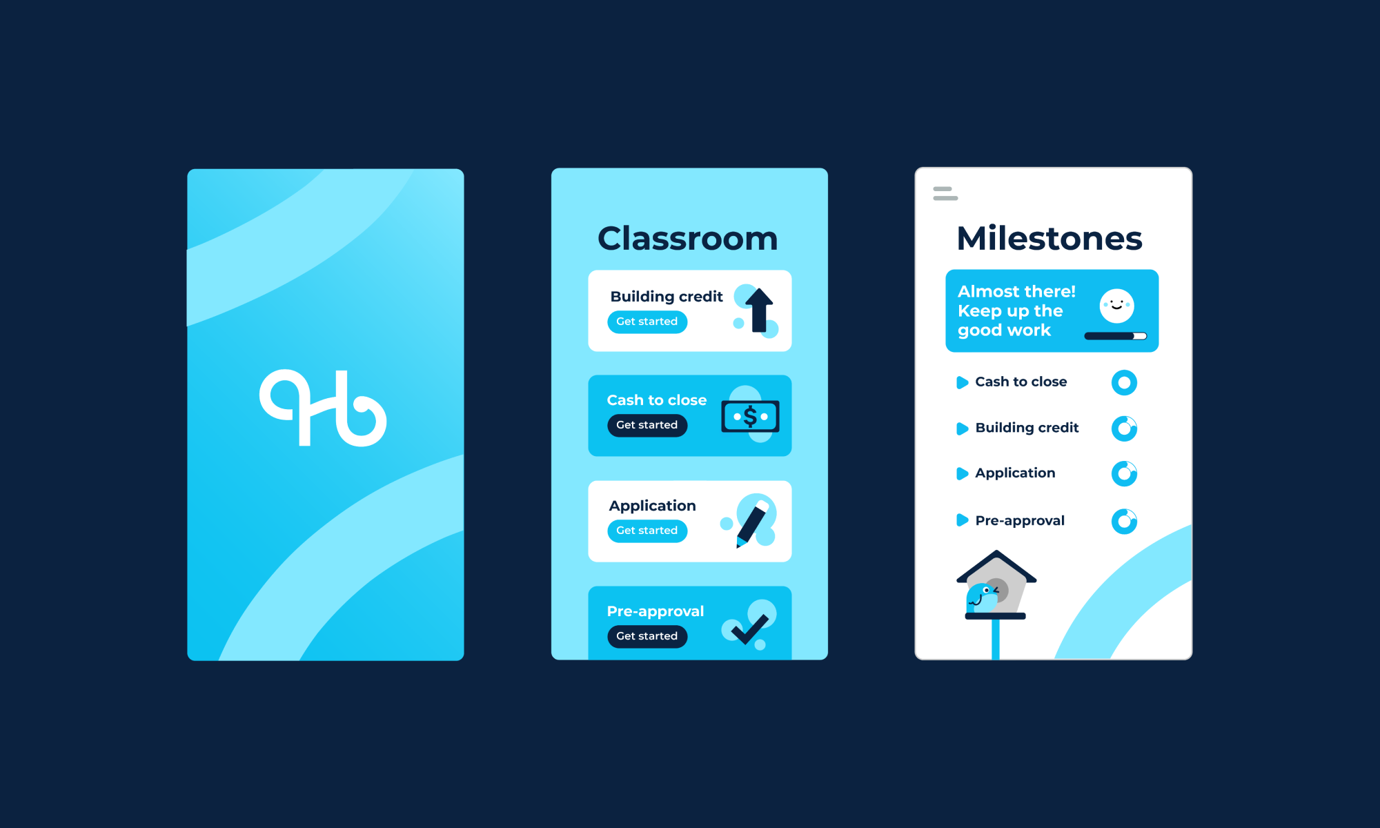
We created a custom logotype and app icon with curved lines that visualize the users’ path to homeownership. The curve motif carries into the rest of the brand design, adding movement and energy throughout. Details in the typography give the logo a whimsical flair, while still being clean and professional.
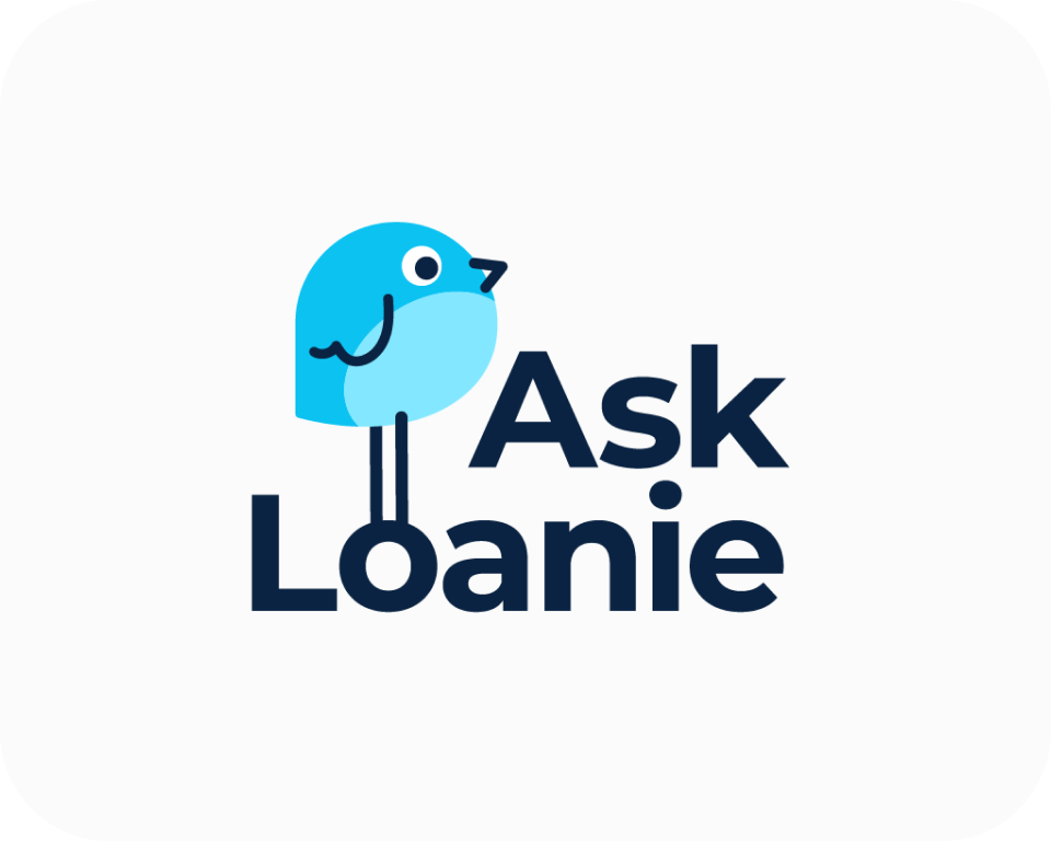
One of our favorite aspects of this project was the opportunity to design the app’s chatbot character. A bird was the obvious choice to tie in with NFM Lending’s core brand, but we took a playful approach to the design, adding quirky features that dial up the cute factor.
We envisioned how the brand’s elements would live on-screen, ensuring that the app experience would be cohesive with the visual identity. Rounded buttons, gradients, and bubbly icons make the app design feel approachable and current. Lastly, we added finishing touches to the brand design with custom profile avatars and geometric illustrations.
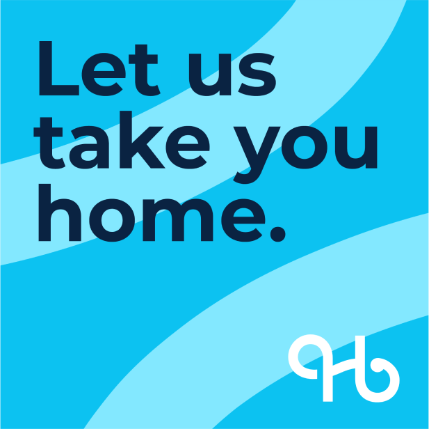
“Let us take you home.”
